A Design System defines the language and building blocks of an organisation's digital experiences. It is primarily used by designers and developers, and aims to bridge the two professions.
Through working with Design Systems over the last few years, I've grown a list of some helpful resources, tools and examples. I keep this list updated so come back soon, ya hear!
Examples
Here is a list of fantastic Design Systems that I reference and admire.
Fluent UI by Microsoft
Fluent UI is Microsoft's Design System for cross-platform applications, such a Office 365. There are multiple component libraries which implement the Fluent design language for React, Native and React Native experiences.
The launch of Fluent included a really snazzy video, as well as an article from The Verge.
Encore by Spotify
Encore is a really interesting take on Design Systems, because it's not one design system, but a heirachy of Design Systems from global to product level. Unfortunately the websites aren't public, but there is a fantastic article on their website, as well as some talks on YouTube.
Balance by Reckon
What? I can't take inpiration from a Design System I worked on?
ChakraUI
Personally, I think the best design systems aren't the ones built for the masses, but the opinionated ones built for purpose by a company. Still, if you need to reference some high-quality components, ChakraUI is not bad at all.
Design Systems for Figma
A collection of some fantastic Design System Figma files.
More
- Primer by GitHub
- Braid by Seek
- Atlassian Design System
- The Australian Government Design System
- Carbon by IBM
- Lightning by Salesforce
- Audi brand
- Goldman Sachs
Tools
Some of the must-have tools for anyone building a Design System.
Figma
If you're designing a Design System, Figma is the go-to design tool. Not only is it collaborative thanks to it being cloud-based, but you can define symbols (and variants of them) that can be used across files - perfect for product design teams. The plugin library is also full of useful enhancements.
Check out Design Systems for Figma if you're ever looking for some great examples.
StoryBook
Storybook is the current favourite framework for documenting your component library. By writing 'stories' for each component you can display all of the variants of a component, it's props and the API for how to use it. On top of that, Storybook offers visual testing tools and services, as well as collaboration tools if you deploy to their cloud.
Docz
Docz is another great framework for building a documentation site for your component library. Each page is generated using
files - Markdown with JSX flavouring. My one complaint about it is that the process for building a custom theme for Docz was not well documented. Still, if you want to build a pretty decent documentation site without much time, Docz is a safe bet..mdx
Playroom by Seek
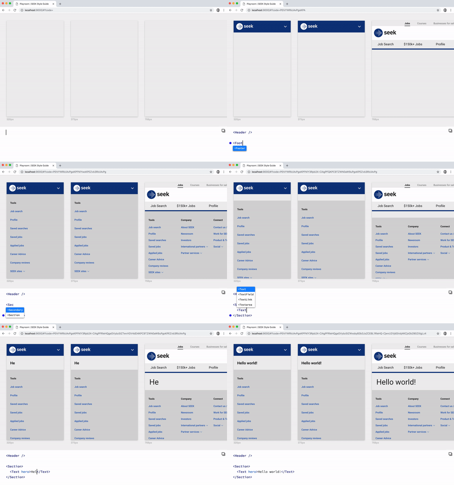
Playroom is a wonderful code-oriented design environment where you can use your Design System components to see how layouts will look on a variety of screen sizes. It can be deployed alongside your existing design system documentation.
It's great for developers to quickly build a layout without having to spin-up a dev environment, or for designers interested in getting their hands dirty with code.

Contrast
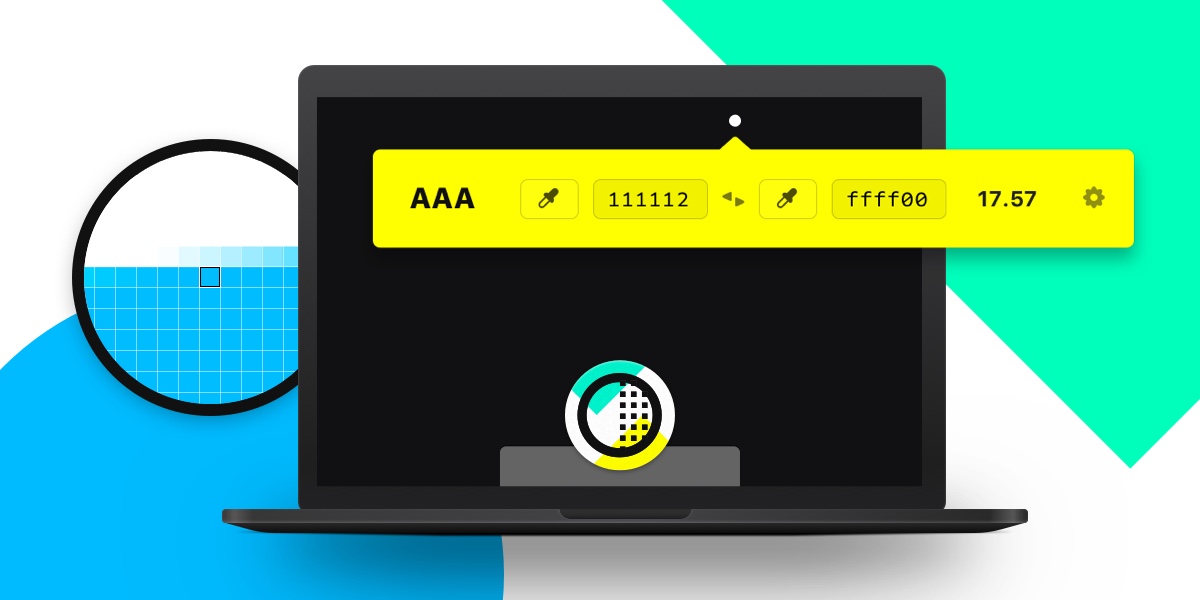
Contrast is a sleek macOS menubar app for quick access to WCAG color contrast ratios. I use it very reguarly while designing interfaces or design systems. I am quite a big fan of it's creators, Matt D Smith and Sam Soffes.

ColorBox
ColorBox.io is a fantastic web application for generating shades of colors, for use in a Design System. By defining the HSL values of the start and end colours, as well as specifying how many steps you would like, colorbox generates a range of colours that you import into Figma or your design system codebase.
Shades
Shameless plug, but I created my own version of a colour palette generation app. I built Shades as a challenge to myself to reimplement colour-conversion algorithms in JavaScript, which I then gave a talk about at SydJS. It's different to Colorbox as you input a singular HEX colour and it generates shades of that color.
TypeScript
Yes, I am one of those people that quite like TypeScript. Being able to enumerate the different props that a component expects, and the documentation benefits that come with that, is perfect for Design Systems.
More
Learning
Design System Meetup
Based in Sydney Australia, the Design System Meetup is a fantastic community of Design System professionals from various organisations, to connect and collaborate.